Showing posts with label NASA Earth Observatory Images. Show all posts

Sunday, 10 May 2015

#Calbuco Ash on the Move

In late April 2015, Calbuco volcano in southern Chile spewed at least 210 million cubic meters (7,420 million cubic feet) of ash and rock during two explosive eruptions. A third eruption, reported to have occurred on April 30, added to the volume of material that already blanketed the landscape.

A significant amount of Calbuco’s ejecta came to rest in neighboring Argentina. But some of that material didn’t stay put for long. On May 3, 2015, the Moderate Resolution Imaging Spectroradiometer (MODIS) on NASA’s Aqua satellite acquired the above image of ash resuspended in the atmosphere—that is, it was picked up by low-level winds like debris in a dust storm. Calbuco (not pictured) is located about 100 kilometers (60 miles) southwest from the lower-left corner of this image.

The resuspension of volcanic ash is not a new phenomenon. For example, satellites have observed wind-blown ash during the 2010 eruption of Eyjafjallajökull volcano in Iceland, and also from old, loose volcanic deposits from past eruptions in Alaska. Resuspended airborne ash, while not fresh from its volcanic source, can still pose a hazard to aircraft by clogging up engines.

Other ejecta from Calbuco moved north toward Villarrica—another volcano in Chile that has seen renewed activity in 2015. On April 27, 2015, the Operational Land Imager (OLI) on Landsat 8 acquired the image below, which shows a small steam or ash plume rising from Villarrica. But the brown, airborne material surrounding the volcano, and presumably some of the brown material on its flanks, is from Calbuco, located about 220 kilometers (140 miles) to the south.


NASA image courtesy Jeff Schmaltz, LANCE/EOSDIS MODIS Rapid Response Team at NASA GSFC. Landsat 8 image by Jesse Allen, using Landsat data from the U.S. Geological Survey. Caption by Kathryn Hansen.
Instrument(s): 
Aqua - MODIS
Landsat 8 - OLI

Friday, 8 May 2015

Cloudy Earth - #Africa


Decades of satellite observations and astronaut photographs show that clouds dominate space-based views of Earth. One study based on nearly a decade of satellite data estimated that about 67 percent of Earth’s surface is typically covered by clouds. This is especially the case over the oceans, where other research shows less than 10 percent of the sky is completely clear of clouds at any one time. Over land, 30 percent of skies are completely cloud free. 
 
Earth’s cloudy nature is unmistakable in this global cloud fraction map, based on data collected by the Moderate Resolution Imaging Spectroradiometer (MODIS) on the Aqua satellite. While MODIS collects enough data to make a new global map of cloudiness every day, this version of the map shows an average of all of the satellite’s cloud observations between July 2002 and April 2015. Colors range from dark blue (no clouds) to light blue (some clouds) to white (frequent clouds).

There are three broad bands where Earth’s skies are most likely to be cloudy: a narrow strip near the equator and two wider strips in the mid-latitudes. The band near the equator is a function of the large scale circulation patterns—or Hadley cells—present in the tropics. Hadley cells are defined by cool air sinking near the 30 degree latitude line north and south of the equator and warm air rising near the equator where winds from separate Hadley cells converge. (The diagram here illustrates where Hadley cells are located and how they behave.) As warm, moist air converges at lower altitudes near the equator, it rises and cools and therefore can hold less moisture. This causes water vapor to condense into cloud particles and produces a dependable band of thunderstorms in an area known as the Inter Tropical Convergence Zone (ITCZ).

Clouds also tend to form in abundance in the middle latitudes 60 degrees north and south of the equator. This is where the edges of polar and mid-latitude (or Ferrel) circulation cells collide and push air upward, fueling the formation of the large-scale frontal systems that dominate weather patterns in the mid-latitudes. While clouds tend to form where air rises as part of atmospheric circulation patterns, descending air inhibits cloud formation. Since air descends between about 15 and 30 degrees north and south of the equator, clouds are rare and deserts are common at this latitude.

Ocean currents govern the second pattern visible in the cloudiness map: the tendency for clouds to form off the west coasts of continents. This pattern is particularly clear off of South America, Africa, and North America. It occurs because the surface water of oceans gets pushed west away from the western edge of continents because of the direction Earth spins on its axis.

In a process called upwelling, cooler water from deep in the ocean rises to replace the surface water. Upwelling creates a layer of cool water at the surface, which chills the air immediately above the water. As this moist, marine air cools, water vapor condenses into water droplets, and low clouds form. These lumpy, sheet-like clouds are called marine stratocumulus, the most common cloud type in the world by area. Stratocumulus clouds typically cover about one fifth of Earth’s surface.

In some of the less cloudy parts of the world, the influence of other physical processes are visible. For instance, the shape of the landscape can influence where clouds form. Mountain ranges force air currents upward, so rains tend to form on the windward (wind-facing) slopes of the mountain ranges. By the time the air has moved over the top of a range, there is little moisture left. This produces deserts on the lee side of mountains. Examples of deserts caused by rain shadows that are visible in the map above are the Tibetan Plateau (north of the Himalayan Mountains) and Death Valley (east of the Sierra Nevada Range in California). A rain shadow caused by the Andes Mountains contributes to the dryness of the coastal Atacama Desert in South America as well, but several other factors relating to ocean currents and circulation patterns are important.
Note because the map is simply an average of all of the available cloud observations from Aqua, it does not illustrate daily or seasonal variations in the distribution of clouds. Nor does the map offer insight into the altitude of clouds or the presence or absence of multiple layers of clouds (though such datasets are available from MODIS and other NASA sensors). Instead it simply offers a top-down view that shows where MODIS sees clouds versus clear sky.

Since the reflectivity of the underlying surface can affect how sensitive the MODIS is to clouds, slightly different techniques are used to detect clouds over the ocean, coasts, deserts, and vegetated land surfaces. This can affect cloud detection accuracy in different environments. For instance, the MODIS is better at detecting clouds over the dark surfaces of oceans and forests, than the bright surfaces of ice. Likewise thin cirrus clouds are more difficult for the sensor to detect than optically thick cumulus clouds.
NASA Earth Observatory images by Jesse Allen and Kevin Ward, using data provided by the MODIS Atmosphere Science Team, NASA Goddard Space Flight Center. Caption by Adam Voiland, with information from Steve Platnick and Tom Arnold.
Instrument(s): 
Aqua - MODIS

Thursday, 7 May 2015

Mapping Forest Loss with Landsat


With at least one image of every location on Earth per season for 43 years, the Landsat data archive contains more than 50 trillion pixels. So how could you put all of that imagery to use in discovering and monitoring subtle changes on Earth? One answer lies in the clouds—cloud computing, that is.

Since the 1990s, University of Maryland geographers and remote sensing specialists Matthew Hansen and Sam Goward have been mapping changes in Earth’s land cover. “We wanted to know the impact of disturbance—harvesting, thinning, fires, storms—things that lead to changes in forests,” said Goward. “Every time you disturb a forest, it restarts the growth cycle, and when you do that, you impact the carbon cycle. Very few forests make it through a full growth cycle because of disturbances, but no one knows the patterns or how they impact the carbon cycle.”

For years, Goward and Hansen worked with low-resolution data, but disturbance happens on a small scale that demands something like the 30-meter resolution of Landsat satellites. The trouble was, researchers had to pay for every Landsat scene, and it was simply too cost-prohibitive to consider a global map. “We did the science we could afford,” Goward said, “not the science we wanted to do.”

Then in 2008, the game changed. Landsat data was made freely available on the World Wide Web. “We then knew we could make a global map,” Hansen said, “but we didn’t have the computing power yet.” While attending an international meeting about deforestation and forest disturbance, he was introduced to Rebecca Moore, a computer scientist and mapping researcher at Google.

Hansen saw an opportunity. “Their computing expertise fit perfectly with our geographic knowledge. So we ported our code for mapping forests to the Google system.”

In just a few days, Google applied the University of Maryland analysis code to 700,000 Landsat scenes, discarding cloudy pixels and keeping clear pixels. They reviewed the remaining sequence of pixels and assigned a flag to each—was it forested or not? The analysis noted the date that forests were cleared or the date when they had grown-in enough to be counted as forest again. The entire process took one million hours on 10,000 central processing units. Moore noted: “The analysis would have taken 15 years on a single computer.”

Above you will find a small sample of that forest-mapping effort. The maps show forest changes near the Congo River in central Africa as observed by Landsat between 2000–2013. Different colors represent the years in which forest parcels changed; in most cases, the change was deforestation.

The maps by Hansen and colleagues agree with other research on deforestation that says anywhere from 53 to 72 Teragrams of stored carbon (mostly trees) were removed from the Democratic Republic of the Congo (DRC) from 2000–2010). Most of the forest losses were due to cut-and-burn agriculture where small plots of land were cleared for subsistence farming or for the use of wood for fuel.

“The patterns of deforestation are clustered around areas of high human population density, which in the DRC tends to be along the major navigable waterways linking people and resources to the capital, Kinshasa,” said Glenn Bush, a researcher at the Woods Hole Research Center. “The pattern of deforestation clearly outlines the main body and tributaries of the Congo river.”
Developing countries like the DRC typically do not have current national forest inventories, if they have any at all. Maps like the Hansen-led effort provide a global standard for mapping, while also filling a void for nations and institutions.

“In a world of scarce resources, there are distinct tradeoffs in costs and benefits of land use, and whether to conserve or convert forest to cropland,” Bush said. “Map-based images are perhaps one of the most succinct means of helping policymakers digest complex ideas of social and economically driven environmental change.”

Armed with their data-rich maps, Hansen and colleagues would like to someday create a global forest loss alert system. The team is also working to develop tools to distinguish the causes of forest change—sich as fire, mechanical removal, disease, storms—from afar.

“We have a globally consistent, locally relevant map product that can be used in a variety of applications: estimating emissions from deforestation, modeling biodiversity, assessing protected areas, and studying forest and human health,” Hansen said. “We plan to move our record forward and backward where Landsat has a sufficiently rich archive of data.”

To learn more about forest mapping and other uses of the massive Landsat archive, read our latest feature: Big Data Helps Scientists Dig Deeper.

Wednesday, 6 May 2015

Plume in Moreton Bay, Australia


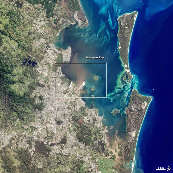
For the second time in as many weeks, the east coast of Australia was hit by a severe storm and deadly flooding. According to news reports, a storm on May 1, 2015, dropped more than 360 millimeters (14 inches) of rain within about three hours in southeast Queensland. As a result of the rainfall, flash flooding caused distinct river plumes to form along the coastline.

On May 3, after the storm had passed, the Operational Land Imager (OLI) on Landsat 8 acquired this view of a plume from the Brisbane River entering Moreton Bay. The second image shows a close-up view of the area.

Flood waters usually contain elevated levels of sediment and colored dissolved organic matter (CDOM), explained NASA ocean color scientist Lachlan McKinna. Sediment tends to scatter red light, and CDOM absorbs blue light. As a result, a brown color is visible at the river’s mouth where these two optical phenomena work in concert.

“However, as you move farther away from the river mouth, the coarser sediments tend to settle to the bottom but the CDOM still hangs around in the water column absorbing blue light,“ McKinna said. “I expect it is elevated levels of CDOM causing the yellow-green patches in Moreton Bay.”

The May storm followed a disturbance that brought destructive winds and floods to New South Wales from April 20–22. And Australia’s west coast did not go unscathed, as rainfall from tropical cyclone Quang drenched the region.
Watch this animation, based on data from the Integrated Multi-satellite Retrievals for GPM (IMERG), to see rainfall accumulate around the Australian coast from April 28 to May 3.
NASA Earth Observatory image by Jesse Allen, using Landsat data from the U.S. Geological Survey. Caption by Kathryn Hansen.
Instrument(s): 
Landsat 8 - OLI

Tuesday, 5 May 2015

Landslide in Langtang Valley #Nepal #Earthquake #Landslide


The headline in the Nepali Times said it all: “Langtang is gone.” The small village, which was located along a popular trekking route near the base of Mount Langtang, was completely buried by an avalanche. The ice and rocks were shaken loose by the earthquake that struck central Nepal on April 25, 2015. At least 200 people perished in the disaster.

While cloudy conditions have hampered satellite observations of Nepal since the earthquake, the Operational Land Imager (OLI) on Landsat 8 captured a clear view on April 30, 2015. A mixture of snow, ice, and debris—which originated in snowfields on the slopes above Langtang—slid toward the Langtang River and buried the village.

Walter Immerzeel and Philip Kraaijenbrink, members of a group of volunteer scientists with expertise in remote sensing, were the first to identify and analyze the landslide using Landsat 8. “The Langtang River was completely covered by the deposit that buried Langtang Village, but there is no evidence yet of a lake forming behind the blockage,” the scientists noted on their Mountain Hydrology website. “This may indicate that the water has found its way through the debris, snow, and ice.” This is significant because rivers damned with landslide debris can back up and lead to destructive downstream floods if the natural dam fails.
Turn on the image comparison tool to see the landslide debris cover Langtang and the Langtang River.
NASA Earth Observatory images by Joshua Stevens, using Landsat data from the U.S. Geological Survey. Caption by Adam Voiland. Thanks to Walter Immerzeel and Philip Kraaijenbrink for help in locating the Landsat data.
Instrument(s): 
Landsat 8 - OLI

Monday, 4 May 2015

Tsiribihina River, #Madagascar

An astronaut took this photograph of muddy floodwaters and distributary channels in the northern sector of the Tsiribihina River delta on Madagascar’s west coast. It was taken in April 2015 from the International Space Station.
Delta distributaries (channels and streams) have two morphologies: large and relatively straight or small and highly contorted. In the photo, brown sediment has been stirred up by heavy rains; when it reaches the sea, it is swept north (to the left in this image) by local ocean currents. Clearer blue water is visible to the lower right (south). Over thousands of years, the sediment supplied by the river has been shaped by waves into beach ridges along the shoreline. Those ridges appear as many parallel lines, with each line representing a prior coastline on this fast-changing (geologically speaking) coast. The oldest coastline lies furthest inland.

Four cyclones hit Madagascar in the first four months of 2015. Heavy floods followed a mid-January storm and affected not only the 50 kilometer (31 mile) shoreline of the delta but also the lower 75 kilometers (47 miles) of the river.
Astronaut photograph ISS043-E-101832 was acquired on April 12, 2015, with a Nikon D4 digital camera using a 1150 millimeter lens, and is provided by the ISS Crew Earth Observations Facility and the Earth Science and Remote Sensing Unit, Johnson Space Center. The image was taken by a member of the Expedition 43 crew. The image has been cropped and enhanced to improve contrast, and lens artifacts have been removed. The International Space Station Program supports the laboratory as part of the ISS National Lab to help astronauts take pictures of Earth that will be of the greatest value to scientists and the public, and to make those images freely available on the Internet. Additional images taken by astronauts and cosmonauts can be viewed at the NASA/JSC Gateway to Astronaut Photography of Earth. Caption by M. Justin Wilkinson, Texas State University, Jacobs Contract at NASA-JSC.
Instrument(s): 
ISS - Digital Camera

Saturday, 2 May 2015

Power Outages Plague #Nepal


Even before a powerful 7.8 earthquake jolted the country on April 25, 2015, continuous access to electricity was not something the Nepalese could rely upon. The country’s rugged topography prevents Nepal’s main electricity provider—the state-owned Nepal Electricity Authority—from providing service to many rural areas. And even in towns and cities where service is available, chronic power shortages mean the 30 million people of Nepal often face lengthy outages.

In the aftermath of the earthquake, access to reliable electricity has diminished. As shown by the map above, both urban and rural areas face widespread outages. The map, based on data from the Visible Infrared Imaging Radiometer Suite (VIIRS) sensor on the Suomi NPP satellite, shows how the amount of light emitted by towns and cities in Nepal changed before and after the earthquake.
Areas with less light output after the earthquake are shown in shades of orange; areas with the same output are black; areas with more light are purple. The map compares two periods: The pre-earthquake period includes VIIRS observations made on clear days between March 21–30, 2015; the post-earthquake period includes observations from April 19–28. Combining several days makes the observations more meaningful and less prone to error.

The satellite detected widespread power losses after the earthquake. The cities of Kathmandu, Bharatpur, and Hetauda were hit particularly hard. In rural areas, each pixel in the map appears to correspond with a different town or village. The post-earthquake image below, from the VIIRS day-night band, offers a view similar to what an astronaut might see from space. Aside from the faint lights of Katmandu, Bharatpur, and Hetauda, much of the rest of the country is a sea of black.


“Having information about the rural areas is particularly valuable because disaster response teams have had a great deal of trouble getting to and assessing rural areas,” noted Eleanor Stokes, a doctoral candidate at Yale University who works with VIIRS nighttime data.

While the Nepal Electricity Authority has said power would be fully restored in the Kathmandu Valley on April 29, the map offers a glimpse of the power shortages in areas beyond the valley. “What is so useful about the day-night band and what makes it different than most other types of satellite imagery is that it not only tells us about the presence or absence of infrastructure,” Stokes added, “but it actually shows us whether that infrastructure is being used.”

Some areas, particularly in central Katmandu, showed an increase in light during the post-earthquake period. Determining why is not possible with the satellite data alone. It might be explained by the rationing of power both before and after the earthquake, such that certain neighborhoods had power some nights and not others. It is also possible that the algorithm used to detect the light signal in this preliminary data, or the way the data was processed and visualized, could have introduced artifacts related to the clouds associated with the extended monsoon occurring in the region, explained Miquel Román of NASA’s Goddard Space Flight Center.

VIIRS detects light in a range of wavelengths from green to near-infrared, and it has a low-light sensor (the “day-night band”) that can distinguish night lights tens to hundreds of times better than previous satellites. In order to observe city lights and other faint light signals, Román and Stokes had to develop techniques that filter out errors created by moonlight, flashes of lightning, gas flares, clouds, and airborne particles.

“When you look at this kind of map, you have to keep in mind that it is made possible by an experimental technique,” said Román. “This is a preliminary assessment, and we are looking at a part of the world that has a very unstable power supply. This makes teasing out the signal more difficult. We will be refining the data and doing more quality control in the coming days and weeks.”
“While VIIRS data can be useful in the immediate aftermath of a natural disaster for locating severely damaged areas, the satellites daily overpasses mean it will accumulate a valuable record of how Nepal’s light output changes over time,” Román added. “We will be watching closely to see how Nepal recovers. Will power come back gradually, village by village, or will it come all at once? We’re really just at the very first stage of monitoring this tragic event.”
NASA Earth Observatory image created by Jesse Allen, using data provided by Miguel Román, Suomi NPP VIIRS Land Science Investigator-led Processing System (VIIRS Land SIPS), NASA Goddard Space Flight Center. Caption by Adam Voiland.
Instrument(s): 
Suomi NPP - VIIRS

Friday, 1 May 2015

Return to Miyakejima

In June 2000, swarms of earthquakes and a massive volcanic eruption rocked Miyakejima, a small Japanese island about 180 kilometers (110 miles) south of Tokyo. At the height of Oyama’s activity, lava fountains gushed from the summit, hot gas and rock rushed down its slopes, layers of ash blanketed the surrounding landscape, and toxic gases leaked from the ground.

By September 2000, Japanese authorities had ordered a mandatory evacuation of all Miyakejima’s residents. Most of the 3,600 people living on the island relocated to Tokyo. But by 2005, with the intensity of Oyama’s volcanic activity diminishing, authorities began to relax the evacuation order.

Thousands of people have returned. By 2015, the island had a population of 2,775 residents. In many respects, life has returned to normal. Fishing, farming, and tourism are Miyakejima’s primary industries. Six elementary and junior high schools operate in its towns and villages.

But normal is a relative term. Since Oyama still periodically emits large amounts of sulfur dioxide, residents and tourists are supposed to carry a gas mask with them at all times. One third of the island remains off limits. A system of alarm sirens is ready to sound off should sulfur dioxide levels get too high.

The Operational Land Imager (OLI) on Landsat 8 captured this image of Miyakejima on February 11, 2015. While forests have recovered somewhat, broad barren patches of ash remain around Oyama’s caldera. The island’s towns and villages are arranged in a ring along a highway that traces Mikayejima’s coast. Several ports and an airport are visible, facilities that would be crucial if Oyama were to awaken and force another evacuation.
NASA Earth Observatory image by Jesse Allen, using Landsat data from the U.S. Geological Survey. Caption by Adam Voiland.
Instrument(s): 
Landsat 8 - OLI

Thursday, 30 April 2015

Fires in North Korea


Satellites often detect fires in North Korea in April. As snow retreats in the spring, many farmers use fire to clear away last year’s crop debris and to fertilize the soil for the coming season. Such fires generally remain small and produce only modest amounts of smoke. But sometimes they escape the control of their handlers and push into forests on the country’s mountainous terrain.
As in several recent years, control was lost in April 2015.

When the Moderate Resolution Imaging Spectroradiometer (MODIS) on Terra passed over North Korea on April 27, 2015, the satellite observed several large fires burning in the eastern part of the country. Actively burning areas, detected by the thermal bands of MODIS, are outlined in red. Fields and grasslands, mainly in coastal plains and river valleys, appear light brown. Forests at lower elevations appear green; at higher elevations, forests are still brown at this time of year.

Many of the larger, smokier fires appear to be burning in forested highlands near cultivated river valleys. MODIS first began to detect the fires in significant numbers on April 23. By April 27, the number of fires had increased and many had grown significantly smokier. MODIS also observed a sizable plume drifting east over northern Japan.

North Korea faced a serious drought in the summer of 2014. While reasonably warm and wet weather was a late-season boon to crops in November, a dry winter followed. Dried out forests have raised concerns about potential food shortages in the spring.
NASA image courtesy Jeff Schmaltz, LANCE/EOSDIS MODIS Rapid Response Team at NASA GSFC. Caption by Adam Voiland.
Instrument(s): 
Terra - MODIS

Wednesday, 29 April 2015

Tracking the Sulfur Dioxide from #Calbuco #Volcano

Late on April 22, 2015, Calbuco volcano in southern Chile awoke from four decades of slumber with an explosive eruption. Ash and pumice particles were lofted high into the atmosphere, and the debris has been darkening skies and burying parts of Chile, Argentina, and South America for nearly a week. Along with 210 million cubic meters of ash and rock, the volcano has been spewing sulfur dioxide (SO2) and other gases.

Near the land surface, sulfur dioxide is a acrid-smelling gas that can cause respiratory problems in humans and animals. Higher in the atmosphere, it can have an effect on climate. When SO2 reacts with water vapor, it creates sulfate aerosols that can linger for months or years. Those small particles can have a cooling effect by reflecting incoming sunlight.

The images above show the average concentration of sulfur dioxide over South America and surrounding waters between from April 23–26, 2015. The maps were made with data from the Ozone Monitoring Instrument (OMI) on NASA’s Aura satellite. Like ozone, atmospheric sulfur dioxide is sometimes measured in Dobson Units. If you could compress all the sulfur dioxide in a column of atmosphere into a single layer at the Earth’s surface at 0 degrees Celsius, one Dobson Unit would be 0.01 millimeters thick and would contain 0.0285 grams of sulfur dioxide per square meter.

On the maps above, data appear in stripes or swaths, revealing the areas observed (colored) or not observed (clear) by Aura on a given day. Note how the plume moves north and east with the winds. By April 28, the plume of SO2 had reached the Indian Ocean.

“Satellite sulfur dioxide data are critical for understanding the impacts of volcanic eruptions on climate,” said Simon Carn, a part of the OMI team and professor at the Michigan Technological University. “Climate modelers need estimates of SO2 mass and altitude to run their models and accurately predict the atmospheric and climate impacts of volcanic eruptions. SO2 plume images also provide unique insights into the atmospheric transport and dispersion of trace gases in the atmosphere, and on upper atmospheric winds.”

So far, Calbuco has released an estimated 0.3 to 0.4 teragrams (0.3 to 0.4 million tons) of SO2 into the atmosphere. The gas was injected into the stratosphere (as high as 21 kilometers), where it will last much longer and travel much farther than if released closer to the surface. The SO2 will gradually convert to sulfate aerosol particles. However, it is not clear yet if there will be a cooling effect from this event.

The SO2 total is much lower than the recent Holuhraun eruption, which released about 11–12 teragrams, or 30 to 40 times more than Calbuco. “But the SO2 from Holuhraun was emitted over several months and was mostly confined to the lower troposphere, limiting its climate impacts,” Carn noted. “In terms of climate impacts, Calbuco is probably more significant due to the stratospheric SO2 injection.”

The natural color image below, acquired on April 25 by the Advanced Land Imager on NASA’s Earth Observing-1 satellite, shows Calbuco’s plume rising above the cloud deck over Chile.
“Although a single eruption of this size is unlikely to have a measurable effect on climate,” Carn added, “recent work suggests that the cumulative effects of multiple volcanic eruptions of this size in the past decade may have slowed the rate of global warming due to the stratospheric sulfate aerosols produced.”

Sunday, 26 April 2015

Must Read: Ocean Color, Ocean Beauty - Southern Africa, Madagascar and Indian Ocean

Forty-five years ago this week, Americans celebrated the first Earth Day. Sixteen years ago, on April 29, 1999, the NASA Earth Observatory was launched on the World Wide Web. Both the holiday and the web site celebrate awareness of our planet, its power, and its fragility. They also celebrate the simple beauty of the place we call home.

Today’s image captures some of that beauty. This natural-color composite image of Earth was assembled from data acquired by the Visible Infrared Imaging Radiometer Suite (VIIRS) on the Suomi National Polar-orbiting Partnership (Suomi-NPP) spacecraft. It stitches together 671, 551, and 443 nanometer wavelength data from six orbits on April 9, 2015.

Suomi NPP does not actually observe Earth from the perspective shown in this image. The satellite flies in a polar orbit at an altitude of 824 kilometers (512 miles), and its images have a resolution of 375 meters per pixel. (Click here for an example of an individual NPP image.) In the image above, the virtual camera looks down from the perspective of 8,300 kilometers (5,100 miles) above a point at 50 degrees South latitude and 40 degrees East longitude.

This composite image emphasizes the blue in our Blue Marble. Most of the scene is filled by the Indian Ocean (center and left), while parcels of the Atlantic (top left) and Southern Ocean (bottom) fill in the rest and remind us that it is all really one ocean. The image also includes southern Africa and Madagascar, with tropical cyclone Joalene swirling in the Indian Ocean.

NASA image by Norman Kuring, NASA’s Ocean Biology Processing Group using Suomi NPP data. Suomi NPP is the result of a partnership between NASA, NOAA and the Department of Defense. Caption by Mike Carlowicz.
Instrument(s): 
Suomi NPP - VIIRS

Saturday, 25 April 2015

Seaweed Farms in South Korea

The dark squares that make up the checkerboard pattern in this image are fields of a sort—fields of seaweed. Along the south coast of South Korea, seaweed is often grown on ropes, which are held near the surface with buoys. This technique ensures that the seaweed stays close enough to the surface to get enough light during high tide but doesn’t scrape against the bottom during low tide.

The Operational Land Imager (OLI) on Landsat 8 acquired this image of seaweed cultivation in the shallow waters around Sisan Island on January 31, 2014. Home to a thriving aquaculture industry, the south coast of South Korea produces about 90 percent of the country’s seaweed crop. The waters around Sisan are not the only place where aquaculture is common. View the large image to see how ubiquitous seaweed aquaculture is along the coast in Jeollanam-do, the southernmost province on the Korean peninsula.

Two main types of seaweed are cultivated in South Korea: Undaria (known as miyeok in Korean, wakame in Japanese) and Pyropia (gim in Korean, nori in Japanese). Both types are used generously in traditional Korean, Japanese, and Chinese food.

Since 1970, farmed seaweed production has increased by approximately 8 percent per year. Today, about 90 percent of all the seaweed that humans consume globally is farmed. That may be good for the environment. In comparison to other types of food production, seaweed farming has a light environmental footprint because it does not require fresh water or fertilizer.
NASA Earth Observatory image by Jesse Allen, using Landsat data from the U.S. Geological Survey. Caption by Adam Voiland. Congratulations to reader Suzi for being the first to answer the puzzler correctly.
Instrument(s): 
Landsat 8 - OLI

Friday, 24 April 2015

#Calbuco #Volcano Erupts


On April 22, 2015, Calbuco volcano in southern Chile began erupting for the first time since 1972. An ash cloud rose at least 15 kilometers (50,000 feet) above the volcano, menacing the nearby communities of Puerto Montt (Chile) and San Carlos de Bariloche (Argentina). The eruption led the Chilean Emergency Management Agency and the Chilean Geology and Mining Service (SERNAGEOMIN) to order evacuations within a 20-kilometer (12 mile) radius around the volcano. About 1,500 to 2,000 people were evacuated; no casualties have been reported so far.

The volcanic mountain was quiet until tremors began late in the afternoon on April 22. An explosive pyroclastic eruption started at 6:04 p.m. local time (2104 Universal Time) and vigorously spewed ash and pumice for at least 90 minutes. Lava flows were observed from the main vent. A second high-energy pulse of ash occurred around 1 a.m. on April 23, according to SERNAGEOMIN.

At 11:20 a.m. local time (1420 Universal Time) on April 23, the Moderate Resolution Imaging Spectroradiometer (MODIS) on NASA’s Terra satellite acquired a natural-color image of the extensive ash plume (top). Four hours later, at 3:35 p.m. local time (1835 Universal Time), the MODIS instrument on NASA’s Aqua satellite acquired a second view (bottom) as the tan plume continued moving north and east. Note that the second image is at a wider scale than the first.

Satellite instruments also acquired unusual nighttime views of the eruption (below) in the early morning hours of April 23. The joint NOAA/NASA Suomi NPP satellite observed atmospheric waves above Calbuco and its plume. The first image from the Visible Infrared Imaging Radiometer Suite (VIIRS) on Suomi NPP shows the heat signature of the hot ash in longwave infrared (11.45 micrometer channel).

The second image shows the same area as observed by the VIIRS day-night band (DNB), which detects faint light signals such as city lights, moonlight, and auroras. In this case, the DNB detected faint concentric ripples in the mesosphere; they are made visible by airglow—faint light emitted at night when atmospheric gases release energy that they absorbed from sunlight during the day—which the DNB can detect. These ripples are atmospheric gravity waves caused by the shock from the eruption.

Click here to see a time-lapse video of the initial eruption from the ground.


  1. References

  2. Eruptions Blog by Erik Klemetti, via Wired (2015, April 22) Chile’s Calbuco Unleashes Dramatic Explosive Eruption. Accessed April 23, 2015.
  3. The Guardian (2015, April 22) Chile’s Calbuco volcano erupts. Accessed April 23, 2015.
  4. Mashable (2015, April 23) Erupting volcano puts on a dazzling lightning display in Chile. Accessed April 23, 2015.
  5. SERNAGEOMIN (2015, April 23) Calbuco. Accessed April 23, 2015.
  6. University of Wisconsin (2015, April 23) Gravity Waves Associated with a Volcanic Eruption. Accessed April 23, 2015.
The first and second images are by Joshua Stevens, NASA Earth Observatory, and Jeff Schmaltz, LANCE/EOSDIS Rapid Response at NASA Goddard. The third and fourth images are by Jesse Allen, NASA Earth Observatory, using VIIRS data from the Suomi National Polar-orbiting Partnership. Caption by Mike Carlowicz. Special thanks to William Straka of the University of Wisconsin’s Cooperative Institute for Meteorological Satellite Studies (CIMSS).
Instrument(s): 
Terra - MODIS

Thursday, 23 April 2015

#Storm Hits New South Wales, #Australia

Strong wind and heavy rain battered Sydney and other areas of Australia’s New South Wales from April 20-22, 2015. The Moderate Resolution Imaging Spectroradiometer (MODIS) on NASA’s Aqua satellite acquired this image of the storm on April 21.

A news report in The Guardian cited David Elliott, the New South Wales emergency services minister, who called the storm a “once-in-a-decade” event. The story noted that some areas saw winds that reached 100 kilometers (62 miles) per hour and rainfall amounts of about 300 millimeters (12 inches) within 24 hours. As a result of the storms and flooding, 12 areas were declared natural disaster zones.
NASA Earth Observatory image by Jesse Allen, using data from the Land Atmosphere Near real-time Capability for EOS (LANCE). Caption by Kathryn Hansen.
Instrument(s): 
Aqua - MODIS

Wednesday, 22 April 2015

#Global Views of Our #Planet, Then and Now #EarthDay


In the decade before the first Earth Day, our view of the planet was still fuzzy. Scientists and engineers of the 1960s were experimenting with satellites to see if and how they could be useful for meteorology and Earth science. Early space imagers were similar to black-and-white television cameras, and the resolution was crude because engineers were still figuring out how to gather, compress, and send data with radio signals.

One giant leap for satellites came in 1965. One month after the launch of the ninth Television Infrared Observation Satellite (TIROS-IX), researchers from NASA, RCA, and the U.S. Weather Bureau assembled 450 satellite photos into the first global composite view of Earth. The image at the top of this page shows the cloud cover of the entire planet as it appeared to TIROS-IX on February 13, 1965. The satellite circled the Earth every two hours in a polar orbit and used its two cameras to collect 40 images of the sunlit side on each pass. The images were sent by radio signals to ground stations in Virginia and Alaska, then relayed and assembled in Washington, D.C.

In a 1968 NASA history of early observations of Earth, the authors described the scene:
A tropical storm can be seen over Ceylon and the southern tip of India, and another is over the south Indian Ocean. In the lower right, a storm is approaching the southern coast of Australia...The thin band of clouds extending from central North Africa across the Red Sea to Saudi Arabia indicates the location of the jet stream...The remnants of an old storm are indicated by the comma-shaped cloud array over the North Atlantic Ocean...A strong weather front is depicted by the clouds extending across the southeastern United States; another storm is moving into the northwestern United States from Canada.”
The importance of this picture lies in the fact that it provides the meteorologist with weather information over the entire Earth, whereas conventional observations before satellites provided information on less than 20 percent of the Earth’s atmosphere.
Fifty years later, NASA and NOAA (the successor to the Weather Bureau) captured a global composite of Earth with the Visible Infrared Imaging Radiometer Suite (VIIRS) on the Suomi NPP satellite. The natural-color image was acquired on February 13, 2015, exactly 50 years after the TIROS IX composite. Unlike the 1965 effort, the modern composite is almost routine. Global composites are made daily, with computer tools fitting together fourteen 3000-kilometer wide swaths of the planet that are collected each day. It has taken a lot of effort through multiple generations of satellites—and engineers, scientists, data handlers, and hardware builders—to get from grainy black-and-whites to 375-meter-per pixel daily, color coverage.

“Over the years, the role of satellites in describing the Earth system in all of its glory and complexity has become clear,” said Jack Kaye, associate director for research in NASA’s Earth Science Division. “Our ability to quantitatively document the many components of the Earth system and how they vary with time and space is one of the great scientific accomplishments of our time. We have the ability to look at all parts of our planet—atmosphere, ocean, ice, and land surface—and watch them evolve.”

“With the research carried out by the scientific community, we can understand how these components work with each other,” Kaye added. “We are thus better positioned to provide information about Earth’s evolution, not just for scientists, but for all the world’s citizens, governments, and businesses who have to make environmentally-based decisions for the future.”

Click here to learn more about how NASA is celebrating Earth Day with social media and live public events.
TIROS IX image by NASA. NASA Earth Observatory image by Jesse Allen, using VIIRS data from the Suomi National Polar-orbiting Partnership. Suomi NPP is the result of a partnership between NASA, the National Oceanic and Atmospheric Administration, and the Department of Defense. Caption by Mike Carlowicz.
Instrument(s): 
Suomi NPP - VIIRS

Tuesday, 21 April 2015

#Iceberg B-34 Makes Its Debut off #Antarctica

On March 6, 2015, the U.S. National Ice Center (NIC) discovered a new iceberg adrift off the coast of Antarctica. Measuring 27 kilometers (17 miles) long, iceberg B-34 meets the 19-kilometer minimum required for tracking by the NIC.
The berg appears to have fractured from West Antarctica’s Getz Ice Shelf and moved out into in the Amundsen Sea sometime in mid- to late-February 2015.

The Moderate Resolution Imaging Spectroradiometer (MODIS) on NASA’s Terra and Aqua satellites acquired these images spanning the calving event. The first image (left) shows the iceberg on February 16, when it was still attached to the ice shelf. By February 28 (middle), it appears to have separated somewhat. By March 5 (right), it is floating freely.

B-34 is the 34th iceberg from the “B” quadrant of Antarctica (located between 90 degrees East and 180 degrees) to be tracked by the NIC. The new berg is still smaller, however, than the much older B-15T—a fragment of B-15 that initially broke off from the Ross Ice Shelf in March 2000.

Large icebergs can have large-scale impacts on the Southern Ocean. For example, as the bergs melt, the addition of cold, fresh water to the saltwater ocean can affect ocean currents and circulation. Researchers have shown, however, that even more fresh water comes from the melting of smaller and much more numerous bergs.
NASA images by Jeff Schmaltz, LANCE/EOSDIS Rapid Response. Caption by Kathryn Hansen.
Instrument(s): 
Aqua - MODIS

Monday, 20 April 2015

Rivers and Snow in the #Himalayas

This photograph was taken from the International Space Station as astronauts flew over the Himalaya range, near the China–India border. It shows one of the main ranges of the Himalayas, where peaks cast strong evening shadows on the snow. The mountains in this image reach great altitudes (5,200 meters or 17,000 feet); the peaks just beyond the upper edge of the image reach high enough (6,500 meters or 21,325 feet) to host glaciers.

For millions of years, water has eroded rock from these high mountains and deposited the sediment in ancient, broad alluvial fans. Snow cover highlights these strikingly smooth surfaces, while a trellis-like network of gullies cuts through and casts sinuous shadows. The largest river in the scene has cut a 500-meter-deep (1,650 foot) canyon (right).

Although the rivers in this photo drain northward from the Himalayas, they ultimately flow back to the south. The streams accumulate in the Sutlej River (not in this photo) and pass through the mountains toward the lowlands of Pakistan and, finally, the Arabian Sea.

Astronaut photograph ISS043-E-93251 was acquired on April 8, 2015, with a Nikon D4 digital camera using a 500 millimeter lens, and is provided by the ISS Crew Earth Observations Facility and the Earth Science and Remote Sensing Unit, Johnson Space Center. The image was taken by a member of the Expedition 43 crew. The image has been cropped and enhanced to improve contrast, and lens artifacts have been removed. The International Space Station Program supports the laboratory as part of the ISS National Lab to help astronauts take pictures of Earth that will be of the greatest value to scientists and the public, and to make those images freely available on the Internet. Additional images taken by astronauts and cosmonauts can be viewed at the NASA/JSC Gateway to Astronaut Photography of Earth. Caption by M. Justin Wilkinson, Texas State University, Jacobs Contract at NASA-JSC.
Instrument(s): 
ISS - Digital Camera

Sunday, 19 April 2015

Winter Blooms in the Arabian Sea

Winter is the prime season to see filaments of phytoplankton twist and curl amid the Arabian Sea. On February 14, 2015, the Moderate Resolution Imaging Spectroradiometer (MODIS) on NASA’s Aqua satellite acquired this image of the region’s winter blooms.

Why winter? It turns out that in this part of the world, seasonal wind patterns have a large effect on blooms. The winter monsoon brings a reversal of wind direction—from southwesterly to northeasterly—which stirs up nutrients that help phytoplankton thrive.

Not all phytoplankton are the same, however, and research has shown that the composition of the communities in the Arabian Sea has shifted. A study published in 2008 reported that an unusual abundance of Noctiluca scintillans (also called Nocticula miliaris) has started showing up in winter blooms over the last decade. The newcomers have replaced the populations of diatoms that previously prevailed.

Research published in 2014 confirmed that the outbreak of N. scintillans in the Arabian Sea is due to an unprecedented amount of oxygen-deficient water near the sea’s surface. The exact reason for the influx is still under investigation. What is apparent, however, is that N. scintillans is better equipped to handle the low-oxygen environment.

The shift could have implications for the food web of the Arabian Sea. In the past, fish ate the copepods that fed on the plentiful diatoms. In contrast to the diatoms, N. scintillans appears to be too large for consumption by copepods and instead feed creatures like jellyfish and salps. How this disruption to the traditional food chain will impact regional fisheries remains to be seen.
NASA image by Norman Kuring, NASA’s Ocean Color web. Caption by Kathryn Hansen.
Instrument(s): 
Aqua - MODIS

Saturday, 18 April 2015

Wildfires in Southern #Siberia

Farmers in the steppe of southern Siberia have an old tradition of burning dried grass in the spring to fertilize the soil for the coming year. In April 2015, unusually warm temperatures and strong winds turned the tradition into a nightmare. Several fires escaped the control of their handlers and spread rapidly across the dry landscape. According to media reports, escaped fires had devastated several villages, caused the deaths of about two dozen people, and left thousands of people homeless. Several smoky fires burned in Zabaikalsky Territory on April 14, 2015, when the Moderate Resolution Imaging Spectroradiometer (MODIS) on NASA’s Terra satellite acquired this image. The fires are outlined in red. Several dark burn scars are visible through the smoke.
NASA image courtesy Jeff Schmaltz, LANCE/EOSDIS MODIS Rapid Response Team at NASA GSFC. Caption by Adam Voiland.
Instrument(s): 
Terra - MODIS